Colours in the interior. 5 steps in choosing them.
We understand that the product's wide range of ten colours and spells like RAL 3028 sometimes hinder rather than help you. So take our clear guide to making colour choices for your home. What colour to paint, what to use to choose light and dark shades for furniture, and what do each colour actually mean?
1. Be inspired, but trust your intuition
Start with inspirational pinterest boards, conversations with friends and reading expert opinions. But stick to your personal preferences too and just rule out any colours you don't like. You don't need to know why, your "likes" probably won't change.

TIP: See how interior designer Rachel Smékalová works with colour in her own apartment.
2. Understand your space
The basic lesson is that light colours make a room visually larger but can appear cooler, while dark colours make a room smaller but cosier. The size of the space is not just about the area, ceiling height or window size is also important. For a light room, you can afford more darker colours. Also keep an eye on daylight - where it falls, which parts of the apartment need lighting.
3. Include neutral
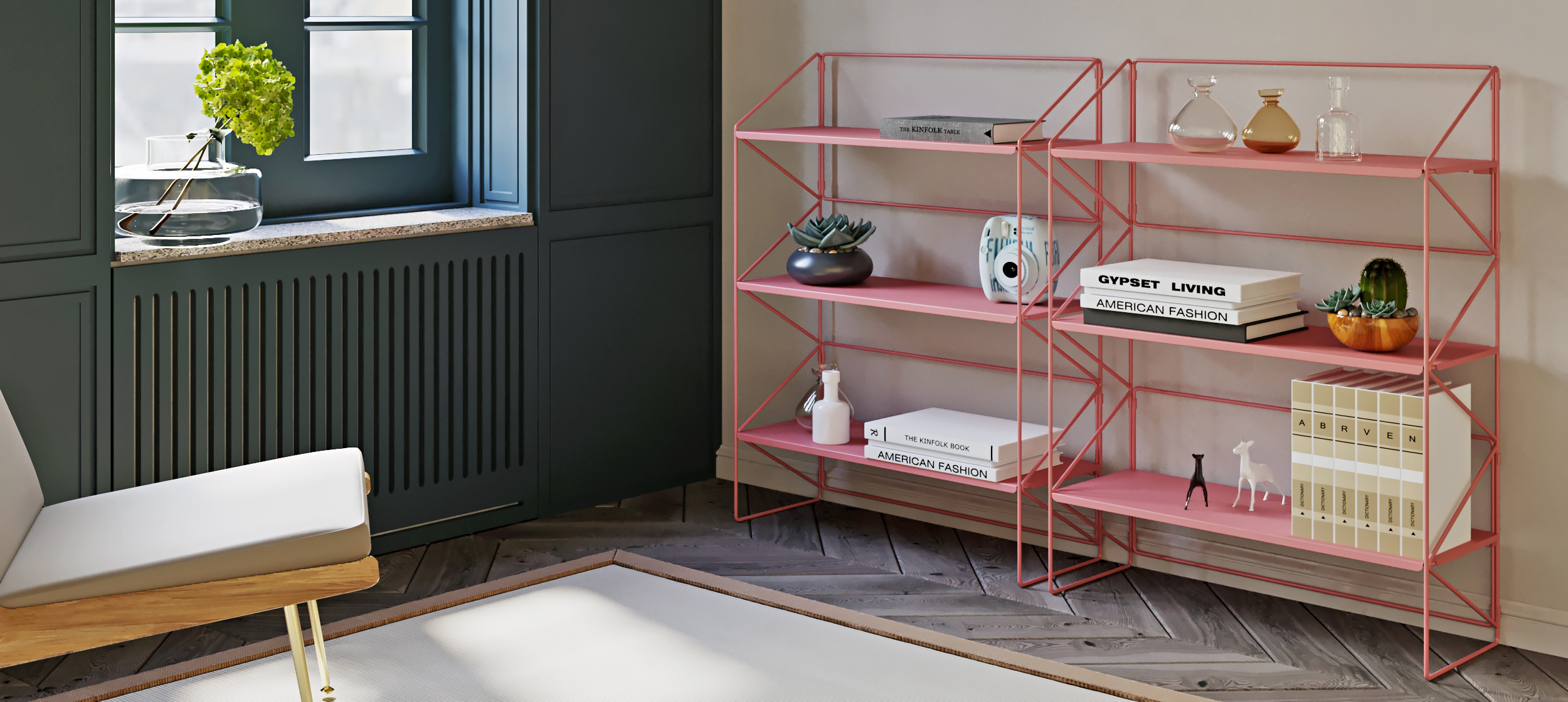
To prevent your home from becoming a marketplace, lay a neutral-coloured foundation. Neutral colours include white, black, grey and natural colours that we find in abundance in nature - brown, beige, blue, green in the form of plants and also old pink, which you will find newly in our permanent offer. Neutrals belong on large surfaces like floors and walls, but work them into your furniture too.
4. Create a swatch book
You'll know that even neutral shades can clash with each other, let alone when you want to add bolder tones. So create a swatch book to test out combinations of colours, patterns and materials. Ideally, take your time and gradually see how the different materials and shades work together, where to subtract or add.
5. Get distinctive things at once
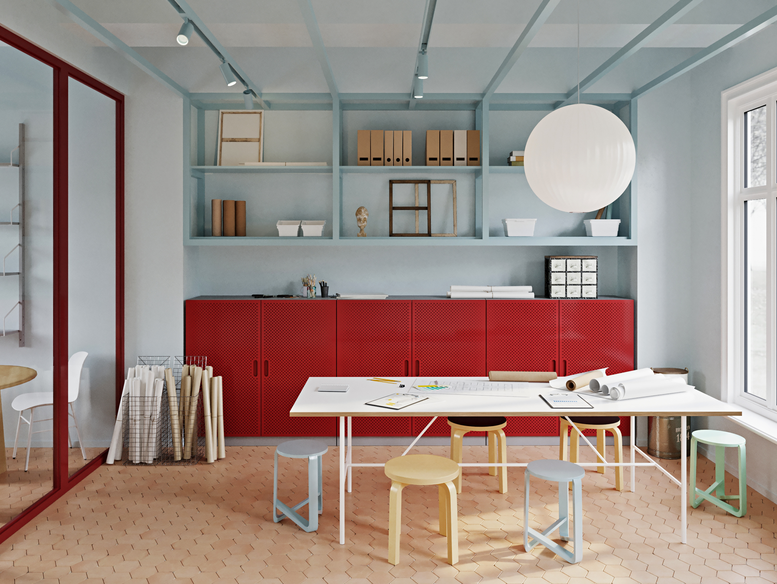
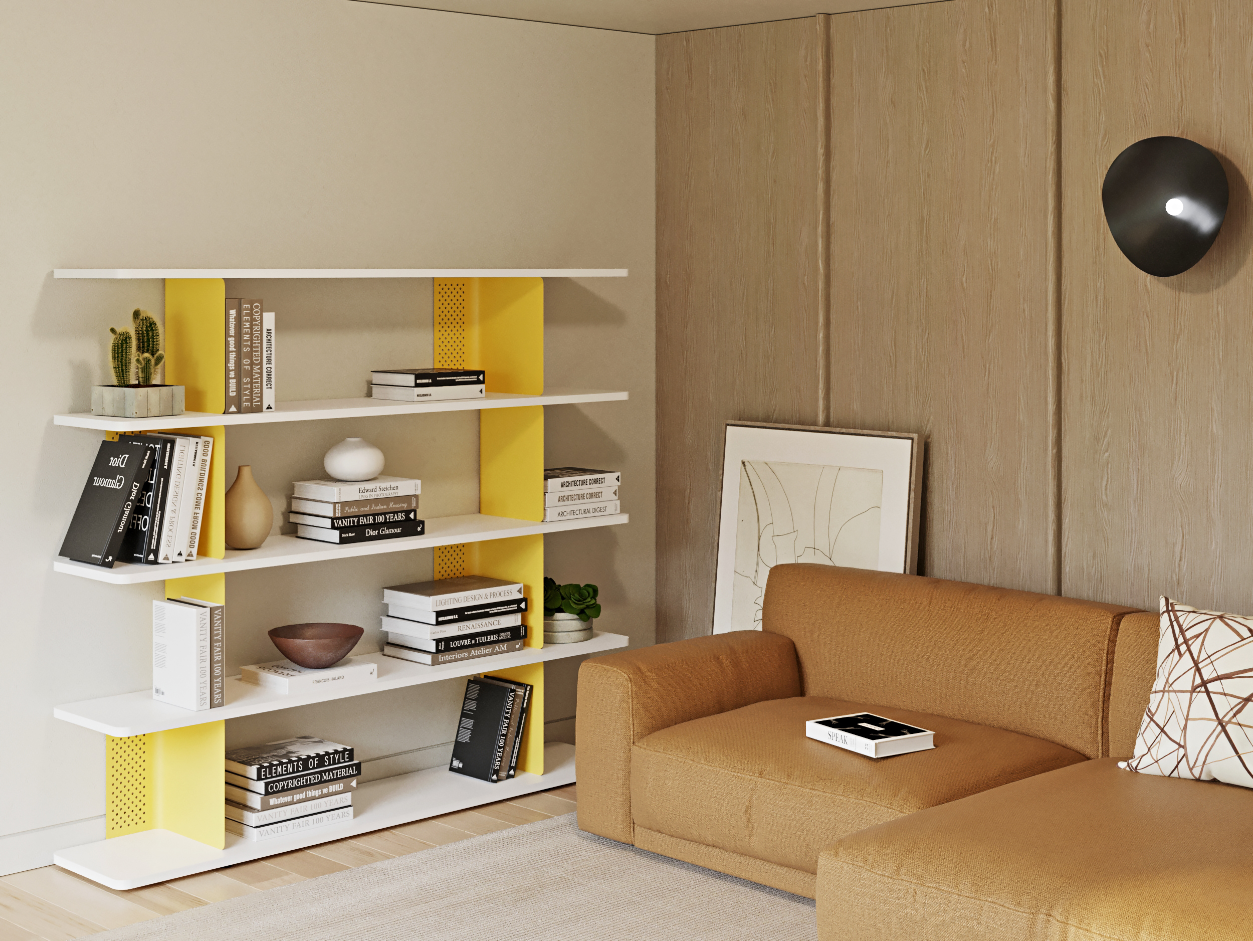
Choose the biggest pieces of furniture together. When you buy pieces gradually, the concept of matching colours often falls apart. The bold colours of our wardrobes and shelving should match the rest of your home; grey or black shelving will fit in pretty much anywhere. Smaller shelves or accessories can light up an uninteresting corner with their unnoticeable colour.
The theory of the colour circle
If you want to delve deeper into thinking about colour combinations, you can work with the colour circle designed by Johannes Itten, a teacher at the Bauhaus in Germany. The circle consists of three primary colours - red, yellow, blue - then secondary colours, which are created by mixing the three primary colours in equal proportions - purple, green, orange - and finally tertiary colours, in which the primary and secondary colours are mixed.
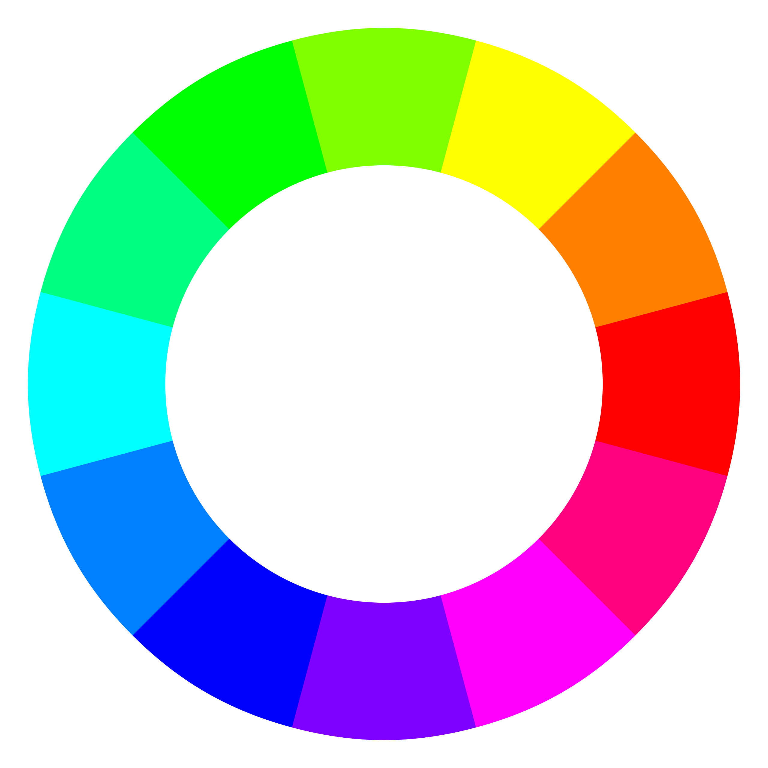
Colours that are opposite each other in a circle are called complementary - they contrast strongly with each other and it is recommended to combine them together. Colours in an analogous scheme also work well together - these are the ones that are next to each other in a circle.
Saturation and brightness
Depending on how much brightness a colour has, it is light or dark (black has zero brightness, white has 100%). Saturation determines how strong a colour is and is basically how much grey it has in it. Only colors of medium brightness achieve full saturation.
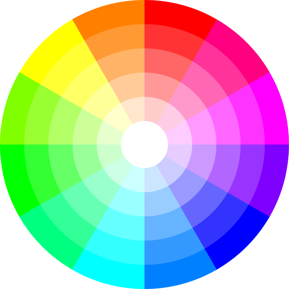
So when you add brightness and saturation to the circle, you expand the range of hues, but complementary and analogous colours will still react the same way to each other. Plus you add a new scheme, namely monochromatic colours - another combination that's great to work with.
Do you believe in colours?
Each holds a different emotion and energy, although some meanings vary greatly across cultures. Of course, it also depends on how subjectively comfortable you are with the colour.
- Blue: peace, harmony, stability, wisdom, truth
- Green: relaxation, freshness, balance, health, renewal
- Yellow: sun, joy, wealth, security
- Orange: creativity, enthusiasm and optimism
- Red: extraversion, sensuality, danger, intensity, strength
- Pink: tenderness, softness, youth
- Purple: mystery, luxury, softness
- Brown: warmth, earthiness, comfort, security
- Black: elegance, minimalism, luxury
- Grey: neutrality, calm, easy to combine with other colours
- White: purity, neutrality, perfectionism, harmony
A few tips for the end
If you're afraid to experiment, stick to neutral colours and use bold colours only on accessories, textiles and small pieces of furniture such as stools, wall units or our metal shelves.
In the beginning, you can furnish your home in two or three main colours.
Bold rich colours combine well with pastels rather than dark ones.
According to the circle theory, tone-on-tone combinations (monochromatic colors), or different intensities from one color, work with analogous colors, those that are next to each other on the circle, and complementary colors, those that are opposite each other.


